Wednesday, 26 December 2012

Codes and Conventions of Ancillary Products

Codes and Conventions of Magazine adverts - 

There are several codes and conventions of magazine adverts. some conventions depend on the genre, the type of music you are promoting etc. But all adverts have the basic things you expect to see on them, from simple things such as a name to small details such as a website.

Here a list of conventions of an advert -


  • Name of artist in Bold, clear Font
  • Name of Album in Bold, clear font
  • Information on were this album can be purchased ( promoting the album and artist) 
  • You could also include a picture of the album cover as a way of letting people know that is the album and also making it recognisable to the audience.
  • Social networking site links or icons
  • Image of the artist so we can recognise the artist
  • Important information such as who it features
  • Could also include Ratings
  • Special effects or added images depending on the artist being promoted and what type of image you are trying to convey.
  • Website


Codes and Conventions of Digipak - 

There are also many conventions of digipak's all depending on the type on genre, colour scheme, font etc. But again there are main elements of a digipak which you expect to see on all digipak's.
Here are the main things you would need to see on a digipak:
  • Name of artist
  • Name of Album
  • Picture of artist
  • Name of both artist and album on spine of digipak
  • Website
  • Copy Right Information
  • Bar-code
  • Parental Advisory (if music contains explicit lyrics etc)
  • Record Label (major and/or minor)
  • Tracklist

Tuesday, 25 December 2012

Purpose of ancillary products

Ancillary Products

As part lo our project we have to also create a magazine advert and a digipak for our artist that we created. This is an extension of our music video and is a good way of promoting our artist and advertising their album. A digipak is a CD cover with an inside. We can either choose to do a 2 panel digipak or a 3 panel digipak.

The purpose of our ancillary products along with the music video rather than just the music video alone is that with the ancillary we can promote our artist more and use these to attract certain audiences and portray our artists image.

As you can see below Lil Wayne's, I am not a Human Being is the name of a track and the name of his album. The purpose of this digipak front cover is to promote the song, promotes all the other songs on his album and to promote himself as an artist. This is affective as it promotes him as a rap artist. For example if people do not know about the song, I am not a human being and they see a magazine advert or a digipak in the stores selling it they are more likely to find out about it which raises awareness of his work, promoting his music.


Thursday, 20 December 2012

Music video problems


Problems

We have been informed that our music video has been a little to explicit visualy and from the sound. This meant we have to blurr the explicit words from the sound everytime they come up and change a couple shots in the editing to make the visuals better.

This is why on my digipak we are going to put as 'parental advisory' logo on to make our digipak legit for our audience.


We added these shots to match the genre of our track and to make our music video look realistic and unique. But we have to reduce some of this due to the educational system. This may make our video look more dull or may make it look more effective due to the better positioned and recorded new shots. We have to just do it and see.
(Photos/videos of new editing parts will be uploaded)

Problem during photoshop


Problem

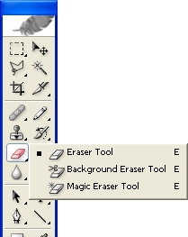
A massive problem i have been having while working on my digipak on photoshopis, using the rubber tool to rub out the edges to make some images look smoother and unakward. This made me spend a massive amount of time plus efforts/caution on the work. Any little mistake would mean i had to undo and start again (and i made plenty mistakes).


Another problem i had was deciding the layout of my work, plus how/where i should position my images/font. I wanted to follow my mock up but it turned out to be a little dry, and needed more to it to make it look more effective. Thhis meant i had to search up my influenced artists digipaks and see what kind of things i could add to it.

The style wanted
Other than those problems, everything else has been going very well for me, and my progress has been becoming very good. My digipak is consistant and has the same style going on throughout.

Advertisement ideas


Inspiration 


This is Rick Rosses advertisement. I have been taking many ideas from this artist as he does the same genre as me, plus his style matches my style. In this advertisement, i would like to use the same layout seen and the same kind of photo. I want my photo to blend into the background so it looks like he is hidden. I will use the colours and font i have been using during my digipak but just take this layout and visual image. The thing i will add to mine is an image of the front cover on the album.

Another example:


In this example i was thinking to the the 2 images on each side and have the text in the middle which looks like it combines everything together. This looks visualy good and interesting.

Progress during photoshop


My front and back cover


This is what i made as my front and back cover. I have made changes which the teacher said would be more suitable and effecive.


IMAGE!!!!!!


As you can see in this photo, i have tooken out the images on the back cover and also took out the 'new' sticker. Then i changed the layout of the information at the bottom and changed the background image behing the text 'i play dirty' at the back cover. This suited the digipak more and made it look more appealing to the audience. Finally i added the word 'pats' across the spine untill it filled it all.


Tuesday, 18 December 2012

Main influenced artist for my digipak


Rick Ross


This artist has given me many ideas which i will like to use. I am aiming to make my digipak look like his style of work, plus use many of his visual styles.

For example the text he uses in his work is something i would like to use:


I also like the kind of pictures he uses and the poses he does in these images:


The mise en scene used in his pictures are also important and would fit in my project (tattoos,drinks, cars etc) :


Finally the darkness and shadyness seen in the images which present his emotions inside and show a dark/criminal person:


All of these ideas match my genre and would make my digipak look very professional and appealing to my target audience.

Ideas on what to do for the image in digipak


Ideas

I was thinking, in one of the images of me in the digipak, i might add a drawing effect onto it to make it look more urban and appealing to my audience.

For example:


This would make my digipak look creative and unique, plus it will match the genre of my video/project. I could do this in photoshop by adding the effect onto the image and changing the background colour into whatever i like. This is a really good idea and i will see how it looks on the one of the images i am planning to use.

Another example:

Cinema screening


What happened?


We whent to the cinema 'screen on the green' to watch evreybodys music video on the big screen. It turnt out to be a very good day as we got to see eachothers work and compare our videos to eachothers. We also was able to get feedback from people that watched our video and see the positive/negative sides. This is important because we get to see our strengths and weakneses, plus know what to add and do different in the future to improve our work. The good stuff from the feedback is a congradulations from everyone for making and finishing the music video.


This made me realise how much work i put into this project and how worth it was to do it. It also motivates me to do my digipak at the same high standard as my video. It also showed me ideas on what i could add extra to my digipak as it needs to relate to my music video, and i just saw it on the big screen. It also shows me an idea of how other people digipaks might look.

Monday, 17 December 2012

Inside cover Mock up - Planning


Inside cover


I forgot to put the cd circle around the right side of the 2 panel template. But it will be included in the original one. I will also use less text because i was told by dan that the inside cover should be less text and more images. But these is a ruff draft of how it will look. I might use some effects on the photo and the writing will be black or red.

Photos for Digipak- Planning


Photos i am planning to use:


Inside cover (right side):


This image shows the kind of clothes he is wearing and the type of urban style he is presenting. 

Front cover:


This images shows his tattoos and his facial expression. It is a gangster pose and shows an urban visual style.

Inside cover (right side):


This looks like he is relaxed and shows a fashion shoot style image. It shows he is an artist the audience can look up to. 

Back cover:


This shot angle is good because it is unique and shows the artist in a creative way. The pose he is doing shows urban style. 

Inside Cover (left side):


This image is good because it shows alcohol and the colours look brilliant. It matches the genre of my video and the props/colours used. 

Sunday, 16 December 2012

Where ideas have come from - Planning


Ideas


I have got ideas from the artis Rick Ross as he uses many urban style genre ideas in his visual style. I have decided to use the way he performs throughout my work. He is presented as a 'visous man' plus a 'boss'. In his work he does many unique facial expressions which shows his status.


In this photo we can see his facial expressions and the assesories he has which portray the genre. Also the font and text are suitable to the visual style and everything matches together. We also see his tattoos and gangster style look, which i will also include. This is an example of how i want my work to look and i will be using these ideas.

This is another image example of the kind of visual style i would like to use:


 I will also use many close ups and darkness. This will show my artist to be a dark person (gangster) and show people his emotions from the inside.

An example:


I may also use an effect which makes some of my work look like it was drawn on. This makes it look urban which suites the genre of my project.

For example:

Tuesday, 11 December 2012

Do's and Dont's during design work - Planning


Do's

.Use clear font

.Use appropriate sizes for images/font

.Use clear photos that are in focus

.Use photos that are an appropriate shape for the page

.Use a layout that follows the rule of thirds for composition

.Use an appropriate type face that follows genre conventions/a house style

.Be careful where you place the font, it must follow genre conventions/be clear from a distance

.Follow the conventions of the 3 colour rule and use colour that is apropriate for images/font/background

.Think carefully about how you use and integrate font/text and language/image

.Use appropriate industry logos and conventions, properly positioned barcode/date/copyright/titles/artists name

Dont's

.Stretch images, this will make them out of focus

.Use layer styles

.Use unnecessary effects. Any effects must suit the genre

.Place text across the artists face

.Use a font simply because you like it

.Feel you need a seperate photo on every panel- be creative

Font,Text,Colours,Design - Planning


Examples of types of Text and Font


The font and text seen in all of these images relate and have the same genre presented through them. They all have an urban youth/gangster/street vibe in them. The are bold ad sharp. This is the kind of style I want to use in my digipak/advertisement as it fits with the message and genre I am portraying. The text is big and bold, and the font is sharp and unusual. It is attractive towards the audience my work is aimed for. The designs we see on the writing is something I want to use in my work as it is unique, plus catchy to the eye. The colours are very bright and stand out. This means their will be a lot of reds,yellows,whites and oranges. This represents a hip-hop theme.

Shortlist


3 related Advertisements- Research


Jay-Z 


The layout on this advertisement is very good and it is a good way of presenting the artist while giving out important information. It also shows the album cover. The big writing plus the font is effective and stands out. The colours work and match with the album cover. 

Chris Brown


The way the artist is in main focus is a good thing, I could use in my advertisement. This was done by positioning the artist correctly on the page and making him the biggest thing to stand out. This is important because it makes the audience remember the artist which could lead them to view their songs etc. (good promotional teqnichue). The artist name is the biggest text aswell, this also enforces the artist into the audience.  

Rick Ross


The positioning of the artist in this advertisement is very effective and looks good. The colours also match the genre which i am working on. The font of the writing is also a type of font I am considering on using. It catches the type of audiences eye which i want my work to go out to. The only thing i do not like is the background, the colours are too bright and not visually nice. 

3 related Digipaks- Research


Rick Ross Album cover 


This front cover of the digipak relates to the genre of our ideas. It is a gangster visual style, and the artist is made to look rich/powerful. When we look at the artist we want to be like him and live his lifestyle. This can be an idea we can use because we are working with this kind of genre. The shades and the car can be a prop to use, plus showing the tattoos and jewellery is essential. 

50 cent Front cover


This can relate to our project because it also shows our genre that we want to portray. The effects on the artist make the image look more urban and gangster. The font is the kind of style we want to use in our digipak. The colours also match the genre of the artist. 

Juelz Santana front cover 


We  can relate to this image as we can use the type of colours seen. It has a good sense of urban youth and shows a hip hop vibe. The fonts and text seen is also the style we would like to use. The close up on the artists face is important, because we want to show the artist clearly so the audience knows and remembers him. 

Final Embeded Music video


Monday, 10 December 2012

Previous Students Work

Classwork
In class we looked at some previous students work and were asked to compare them and highlight the positives and negatives of their digipak and magazine advert. As a class we looked at all members of the same groups work comparing their similarities and differences within the groups.
examples of CD covers and adverts from previous students.

Class work comparing three previous students work
 Poppy Power - In my opinion there were hardly any negatives to this digipak and advert.
                         Digipak - Negatives - same image was used for the advertisement.
                                      Positives - made reference to the actual music videos, followed the themes and                                                                                     colours made obvious visual links between video and digipak
                        Advert - Negatives - used the same image as used on front cover of digipak.
                                      Positives - again  follows colour schemes, clear font in not to many styles. follows same theme as digipak linking all of them together.


Photoshop Tutorial


Photo Shop Tutorial 

In class we were given a Photoshop tutorial in which we had to create a practice digipak using specific pictures that we were provided with. We were shown how to open a 2 panel CD cover on to Photoshop and how to import our chosen photos. Then we were sown how to use good tools such as the magic cutter tool which allowed us to draw around the imagine and cut out or background. After that we were given 30 minutes in which we were allowed to explore the Photoshop tools and effects and apply them to our practice digipak.


Thursday, 6 December 2012

Digipak Practice


This is my first attempt of making a digipak using photoshop. Unfortunately I ran out of time during the lesson to finish it but it gave me the opportunity to explore photoshop and learn how it works as well as helping me to start thinking in more detail of ideas for my digipak.

Practice lesson on Photoshoping Dan


Dan Photoshoped 


.I added an effect onto this image which made it look like a black and white drawing
.I also added a reflection effect and doubled it to try and make it look creative.
.I adjusted the brightness and the sharpness of the image to the look that suited me
.Then i added his name 'Dan' on one side to fill up the blank white bits which make the image look akward.
.I was gona put his second name on the other side but i did not get time to finish it

With a little more work, this could become the front cover of the album on the digipak. It would suite his genre.

Practice Cover on PhotoShop

Practice digipak for Photoshop tutorial

This was my practice digipak which as you can see is not very good. This was my first attempt at using Photoshop and I think for a first attempt it is acceptable. I am defiantly going to practice using Photoshop to improve my skills and to make sure that my final digipak and advert are a lot better.


Wednesday, 5 December 2012

Progress Review Blog

I feel that I was more detailed in my blogs during the research and planning stages of the project as opposed to during the time of construction. Perhaps this is because before we began filming and editing I had more time and thought to put into my blogs. I aim to blog far more successfully in detail throughout the production of my ancillary products as I think that the more I blog about what I am physically doing the more ideas I will come up with and  the more opportunities I will have to think carefully about my decisions throughout the remaining of the project.

Overview


Overview


What have you done so far in terms of editing?

First we sorted our clips into those that we want to use and those that could not be used for whatever reason (e.g poor quality, previously missed mistakes etc.). Next we established all our base tracks and matched them up to a particular lyric by marking both the clip and the song at the same point and laying one on top of the other. This ensure that the video will be in sync with the song in terms of lyrics and the timings of the lip syncing. Following this we placed the base tracks onto the timeline. Finally we began cutting the shots and we have even started to
mark potential cut aways.

What do you have  left to do in the editing?

We have a small amount of footage left to get as after sorting through the clips we were left with an unstable amount.
After that we will continue to add cutaways and jump cuts until we are ready to add effects / filters to our shots and start to slow down / speed up any clips where necessary.
If all goes to plan the last thing we do will be adding a few bits of text to the video and tidying up anything else that we may have missed.

What was the best part of this project for you?

For me, the best part of this project was the planning; thinking about colour schemes, costumes, locations, props etc. This is because it is the point where you are able to be as creative as possible and really think about what it is that you want to put across though your video.

If there is anything you could change, what would it be?

I would put more thought into the lighting of the shots before filming to avoid wasted footage because of poor lighting and I would also get more footage initially to save time in the long run.

Skills Development

While constructing this video I have learned many skills to take forward an apply to all areas of media production in the future. As a result I have enhanced my personal skills in everything from planning to filming to editing.

The skills I have developed include;
- *Consider lighting from as early as planning*
- Marking and Matching 
- Cutting tool
- Inserting 'input' and 'output' to a clip
- Slowing down / Speeding up clips
- Adding text to a clip
- Adding transactions between clips
- Rendering clips
- Adding effects / filters
- Organising footage initially

Problems During Filming

As the majority of our shots were filmed at night one of the biggest problems we faced was with lighting. Because we had not practiced our lighting arrangements before our first day of filming we found it a real struggle to get our shots appropriately lit and always knew that we could lose a lot of footage because of this. As a group we put our ideas together in order to be as creative as possible with the little lighting we did have access to and managed to get a fair amount of well lit shots. This was something we definitely all learned from and will know to be more careful with in future.

We also often struggled with getting the camera properly focused at the start of the filming process which slowed us down a lot as we didn't feel as though we could even start recording before the shot was properly in focus. When we were back in college we spoke to our teacher about this problem and it all made sense when we were reminded that the camera should be left on auto-focus as opposed to manual. Following this, throughout the rest of the filming process we were able to keep our shots nicely in focus.

Problems During Editing

Throughout the editing process as a group we were faced with many difficulties;

- Difficulty with rendering shots
- Finding suitable images to use for our green screen shots
- Marking the basetracks to the exact part of the song when first laying them
- Adding text
- Cutting to the beat throughout
- Adding effects/filters


Album Advertisement - Magazine


This magazine advertisement has been kept perfectly simple but the few bits of red text and the fantastic use of image are enough to catch the eye of the target audience.
Plan B has used the positioning along  with the authentic look of the chosen image to reflect his unique style of music. His suit and retro style microphone work hand in hand with the vintage black and white effect and strategic lighting and shadowing.
All important information has been organised and neatly listed down the left hand side of the page and legally required small print has been kept to a sensible size that is readable but no bigger then necessary.
This advert could potentially be used for inspiration to help me when I come to creating my own as part of my digipak.

Examples of Digipaks

Features of an effective Digipak

This is an example of an effective digipak as it includes all the appropriate features. To begin with, a red and white colour scheme is consistent throughout keeping it simple and sophisticated. I also particularly like how the look of the digipak reflects the mood of the album itself. Next, similar but slightly different images have been positioned sensibly and comfortable ensuring that there are no large empty areas. These features combined create a perfectly balanced and suitable theme for the digipak.
Finally, all appropriate information has been included within the digipak (e.g. track list, acknowledgements etc.)


This digipak also caught my eye, particularly as i feel that my group could benefit from taking ideas as inspiration for our own digipaks. This is because I feel that a good balance has been established between keeping the digipak bright, loud and funky as well as sophisticated, fresh and chic - appropriate for our artist and genre.