Thursday, 31 January 2013

Evaluation question 4

Target Audience - 

Our music video had a very specific target audience. Our target audience is young males between the ages of 18 and 25. We target males rather then females and use Mulvey's, 'male gaze' to attract the male audiecnes . We target poeple who are intrested in grime/rap music and have a love for this type of music.  At first we did not focus mainly on males but throughout our filming.

Feedback from Rough Cut


See Post Rough Cut Feedback - Evaluation Question 4

This is the first feedback we got on our music video, this is our rought cut and we got feedback from our media teacher Dan. Dan thought that we have very positive aspcets to our video such as the fast edting, editing to beat, mise en scene and shot types. Although he had lots of positive feedback to give us he also gave us some citicism which we took on board and changed for our final video. He suggested that we removed some of the 'crazy' footage andnot use so much of the party footage. 

Feedback on Final Video from Cinema screening 
After the cinema screening we managed to film some of our audience feedback. Fortunately we did not have a lot of negative feedback from audeicnes between the ages of 17 and 19. Here are some videos of audience giving there opinions on our music video.
Audience Feedbak 1
 

See post - Evaluation Question Four Audience Feedback 2 


See post - Evaluation Question Four Audience Feedback 3


See post - Evaluation Question Four Audience Feedback 4

As mentioned i two of the above videos our music video really stood out in  the cinema as it was very cotroversial, different and followed the normal conventions of a hipHop/grime video.

In two of the clips our audience mention the fact that our video looked very realistic and created a good vibe in the cinema. Most people we asked said that they believed this actually looks like a realistc music video and that they could imagine it on music channels and MTV.


After the cinema screening soem teachers were concerned about our music video and the explict lyrics. They advised us to put the sound down on certain words to make it more acceptable and appropriate. 

What we have learnt through audience feedback?

Throughout the duration of this project we have been given regular feedback from our teachers who have given us ideas and suggestes ways in which to improve the quality of our muic videos and ancillary products. our audience feedback was all positive and the males we asked seemed to like this video and understood the way we incorperated the male gaze. We took on all the feedback we were given and all the advice we were given and produced a good, conventional video.


Question 3 - Evaluation


How did you use media technologies in the construction of your project?

Power Point:


Question 4 - Evaluation


Evaluation Question One

EVALUATION: 2) How effective is the combination of your main product (video) and ancillary texts (digipak and advertisement)

EVALUATION QUESTION 2 - How effective is the combination of you main product and ancillary?

EVALUATION: 1) In what ways does your media product use develop or challenge forms and conventions of real media products?

The conventions of a music video usually include; most obviously, fast-paced editing to the beat of the music. Edits may also be really obvious to draw attention to themselves, such as wipes and special effects. Jump cuts are used frequently  and other rules of 'continuity' editing are broken all in order to draw attention to what is on the screen.

Andrew Goodwin says that music video conventions show that narrative in music videos is approached from a totally different angle to novels and films in the sense that, firstly, they tend to rely on repetition - something that is not used in any other kind of media. As a result of this the audience become more and more familiar with the genre each time viewing the video and begin to form certain expectations of how a music video of that genre should be and the trends it should follow.

Goodwin also explains how the visualisation of a song may go beyond the original meaning and it can be said that there are three types of relations between songs and videos:

Illustration: This is where the video tells the story of the lyrics. Dance is often used to express the feelings/moods in the song.

Amplification: Occurs when the video introduces new meanings that do not contradict with the lyrics but add layers of meaning.

Disjuncture: This is where there is little connection between the lyrics and the video or where the video contradicts the lyrics.

Laura Mulvey looks at other conventions of music videos including what she calls the 'Male Gaze'. She says that there is an obvious imbalance between men and women which forces the audience to view the text from the perspective of a hetrosexual male. To do this, music videos constantly focus on women's curves and women are perhaps objectified to an extent.

Mulvey's theory is something we definitely considered when making our music video as it is used more in grime then most other genres. An example of some videos that also follow this theory and influenced us in this aspect are Dizzie Rascal's 'Holiday', Jay-Z 'Big Pimpin'. In these videos we see barely dressed, attractive women being filmed with sexual camera angles (e.g tilt up legs, slow motion close ups of lips etc.).


                            Jay-Z - Big Pimpin'

                           Dizzee Rascal - Holiday


We learned that the basic conventions of a cd cover include:
- Prominent display of artist name and album title
-Image of artist (echoing visual style and colour scheme of cover)
-No more then 3-4 colours
-No more then 2 fonts
-Elements of graphic design
-Some sort of visual link to advertisement

Conventionally an advertisement should include:
-Prominent display of artist name and album title
-Release date
-Image of digipak itself
-Record label logo
-Same graphic style as digipak


I followed these general conventions when making my digipak and also looked specifically at the conventions of a grime/r&b digipak. Looking at other similar artist's digipak's I found that they tend to use dark colour schemes and maintain a reasonably simple, cool and sophisticated over all look. Here is an image of my cd cover front and back and a few examples of how it follows the conventions and style of what is expected of the genre.


All of the above cd covers have used black backgrounds, a clear introductory image of the artist and simple fonts that, like mine, contrast between the artist name and the title. White or pale fonts have been used as in my cd cover. The example I have provided of Rick Ross's cd cover is most similar to mine with a black and white image and subtle bits of grey.


My advert is also similar to other similar artists' :


I have kept the advert simple with minimal colour but just enough for it to stand out, an image of the cd cover and included relevant dates, credits and logos.

Question 2- Evaluation

Monday, 28 January 2013

Question 1- Evaluation


My media product using, developing or challenging forms of conventions of real media products 


Andrew Goodwin Theory:

Andrew Goodwin feels that traditional narrative analyses (using such ideas as Todorov) don't really apply to pop videos. Pop videos are built around songs and often songs do not pose traditional narrative structures. 
Illustration: This is where the video tells the story of the lyric
Amplification: Occurs when the videos introduce new meanings that do not contradict with the lyrics but add layers of meaning
Disjuncture: This is where there is little connection between the lyric and video or where the video contradicts the lyric.


We will expect to see many conventions in music videos. Edits in music videos come much more frequently than in film, many stand out as disjuncture and the editing seems to have rhythmic basis closely connected to the song. Edits may be really obvious to draw attention to themselves: such as wipes and special effects. A master shot (base track) is frequently used to give the video a structure and the camera may move in time with the music.


I will show you photos from my video and compare them with others from different music videos out their (mostly from the  american artists Rick Ross and Meek Mill):  


My video 


Rick Ross video


Explanation: I got an example to represent the artist and the city he is in. The main atraction that everyone will know in the city. I also made writing come up like rick ross did in his. This introduces the music video and alerts the audience the whereabouts of the artist. This is effective because the audience could relate as they are from the same city and feel involved in the video.


My video


Meek Mill video


Explanation: A shot in the car with a girl is a typical shot artists use in their music video. It matches the genre plus inforces the idea of 'male gaze' which my genre follows. As you can see, i got an example from meek mill as the shot type is very close up but you can still see the artist plus the necessary mise en scene (car/women).


My video


Meek Mill video 


Explanation:  I used a party scene in my video as this appeals to my audience/genre. Meek mill makes his party look very cramped and chaotic to show the audience the party is crazy/mad (makes artist look big/cool). I also made my party scene looked very cramped to show many people are enjoying themselves (to also show the mad/crazy idea of the party). The audience can also enjoy watching other peoples actions in the party and observe what they are doing (also relate).


My video


Krept and Konan video 


Explanation:  The close-up of the lips is also their to enforce the idea of 'male gaze'. It shows the specific audience target, that the artist has girls and makes the audience want to be like him/look up to him. The lips also make the males happy and make positive feedback towards the artist.


My video


Rick Ross video 


Explanation: The shots of friends and alcohol is very affective, as it shows that any friend of the artist is bound to have fun. This makes the audience want to be the artists friend and makes them a fan. The alcohol shows the audience that the artists is also cool and a fun/boss acting person which people look up to and want to be. The alcohol shows the artist has money and shots of friends show the friends must be on his level/ have money, girls, jewellery etc (basically living the lifestyle everyone wants to live).


My video


Rick Ross video 


Explanation: The cars suggest the artist is living a very good lifestyle. The shots with the cars moving and a group of people (including females) infront of cars/motor bikes show the genre of the video plus make the target audience think the artist is good/professional. This allows the audience to see the cars and spot people out from the audience (watch the girls). It draws them into the video and makes them feel a part of it. If they recognise someone in the video they will feel exited. They will rate the artist high and think of him positive. My video is strongly based on mise en scene, as this is what makes my video suit the typical genre it should follow.


The conventions of a Digipak is to promote the artist and show his visual style. The most important thing is to show the audience the artist and make sure they know how he looks like and represent his personality. We can do this by showing images of the artist in a way which will match his presentation (personality). Also we can add font which will match the genre/theme of the artist and add accessories like other images (flames, stars) to show this.

My Advert 


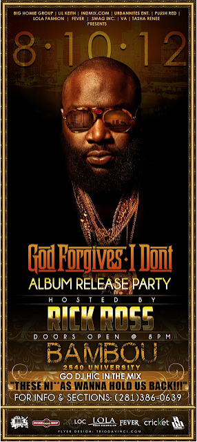
Rick Ross Advert 


Explanation: I followed rick ross's advert as i really liked the layout of it. As you can see my layout is basically the same as rick ross's. I put the image in the same place, plus the writing below is strutured the same. The size of the writing is also aproximately the same. I feel this structure/layout is very effective as it introduces the artist by picture first (makes the audience see who it is first, get a look at the artist), then draws them below to see the information in a unique layout which they will like/enjoy to read. I just added the release date above because i feel this is very important information which the audience need to see, plus added a photo of the front cover to remind the audience the main reason for the advert, plus show people who have not seen the front cover to go and check it up.


Laura Mulveys ideas on Representation

Representation- The way something is shown by whoever makes the representation.
. Involves point of view of producer/ writer / actor/ actress/ channels plus broadcasters or publishers
. Offers Specific messages and values
. Can be either positive or begative depending on who constructs it.

Laura Mulveys translation of her quote- Due to differences in power between men/women, any roles such as writers/ camera men/ producers are taken by men. The way in which women are represented reflects the male point of view and their personal fantasy. 

I believe my music video follows this theory


Evaluation Question 3

How did you use media technologies in the construction and research, planning and evaluation stages?


YouTube Icon

Research - 

During my research process for both music video and ancillary work I used the internet. I used sites such as Google images and you tube to research other music videos, adverts and digipak's and to get an  idea of what the product should look like and contain. 
YouTube - I used YouTube in my research and throughout the entire project manly when research and trying to finalise a song choice.
We watched several videos on you tube that gave us inspiration and helped us start to plan our own music video. We had a general idea of what type of music video we wanted to create but the research on you tube and on other sites helped us get ideas of actual shot types, prop;s and overall mise en scene.


Blogger -

Throughout the entire duration of the project we had to constantly blog about our progress and blog everything we did. Each group had their own blog which allowed us to personalise our blogs and make them loo interesting and more personal. In terms of research we uploaded various video clips and posted various images and information  that we learnt in class and that we did at home. Blogger allowed us to track what we had done and what we were doing and demonstrate our research.

We did not only use Blogger for our research process but used it throughout our planning, construction and evaluation as well. Blogger is an on-line software in which we post or work onto. We used different forms of media on our blogs to make them look better and to show that we have the skills to use different media forms and know our ICT.


JVC Camcorder - When filming we used JVC Camcorders which are top of the range camcorders. This gave us an  advantage and really contributed to the quality of our filming. We were taught how to use these camcorders in as when we created our thriller opening, this allowed us to get straight into filming as we all knew how to work the equipment from our tutorial on it in AS.


Still Camera - While filming we used a still camera to capture images of us filming which allowed us to blog our filming process and give evidence of or filming. This is all part of the blogging we have to do and the images we took on the still camera was a good way of portraying what we were doing through images rather them just text.

PhotoShop - PhotoShop was a major part of our ancillary work as we composed both advert and digipak on Photoshop  We had a tutorial on Photoshop in lesson which helped us get to grips with the way Photoshop works. I found this very useful as I had never used it before and it was exciting to see what type of things could be done on Photoshop. I used Photoshop to create my digipak firstly, i found it very tricky to use all the tools and found the magic laser tool very hard to use as I had to carefully draw around the image i wanted to cut out. I then used it for my inside digipak and magazine advert.

Final Cut Pro - We used finally Cut Pro a lot when making our music video. Again this is a software we are familiar with from AS, but this did not make it easy for us. Compared to the thriller we produced in AS we had to construct our video in a whole different way. Rather then cutting everything and adding to the timeline we had to create  base tracks and upload them and cut between them. This was a good method for making a music video as it would be harder to cut everything individually. I final Cut pro we produce our story board, which we drew, took pictures of then uploaded them onto a time line and added our chosen track behind it. We had some problems with final cut pro during our editing as our footage kept moving along the timeline moving and moving our of sync with the music which we tried hard to get in perfect sync.
Sound Track Pro - Sound Track Pro is  a software used on Mac's. We use this software when adding our music onto our clip. This is the software we use to sync the music with our lips making it look more realistic. This software allowed us to see the waves in the sound which we then perfectly matched up with the waves in the actual video allowing us to lip sync almost perfectly, giving our video a professional realistic look.

Quark - I personally did not use quark to get my fonts for the ancillary products but i did go on it and look at the different types of fonts etc. They had a wide range of font and this is were i found the two fonts that I use in my ancillary products. I found these fonts and really liked them then managed to find them on Photoshop.

Prezi - throughout this project i have used Prezi, an on-line presentation  maker which has allowed me to create presentations that  are detailed, unique and clear. The main task i used Prezi for was our pitch for our music video. I created this Prezi which was detailed. It is easy to use and easy to upload images, videos and clips onto. This made it easy to present and the style of Prezi made our presentation flow and highlight out clear ideas. This is a media form which we used for many blogging tasks as a way of showing our ICT skills and conveying our work in a nice way.


Throughout our blogging tasks we had to use different media forms to show our work.

Slide Share and Power Point Presentation -  I used power point presentation to do some of my blogging tasks then uploaded them onto Blogger through slide share which is a software ghat allows you to view power points on-line easily. This makes them look professional and creates a easy format which is good and fast to view on Blogger.


Research into Magazine Adverts

Adverts 

A magazine Advert is an advertisement on paper usually A4 that is printed in a magazine. Almost all artist have some form of advertisement promoting there album. These magazine adverts can be in any type of magazine, this usually depends on the genre of the artist and their album.

Different types of Magazine Adverts in Different types of Magazines
The placement of the advert in different types of magazines is very important it need to appeal to the  readers of the magazine. for example there would be no point advertising a Hip-Hop album in a children's magazine. This would be a waste of advertisement money as children are less likely to know the artist or go out and purchase there album. In a children's magazine you would expect artists that are young such as Justin Bieber, as this is more appropriate and they are more likely to hassle their parents about getting that album for them rather den a hip-hop artist they are not to familiar with. Therefore the placement of the advert in different types of magazines makes a different to the amount of sales you would receive and would also affect the artists promotion.

Differences in Magazine Adverts due to Genre
All magazine adverts follow the same conventional ideas and have the same purpose; to promote themselves and their music but not all magazine adverts look the same. Different genres have different audiences, styles and ways of portraying themselves which makes it had to say that this is what a magazine advert should look like.


This is a Magazine Advert of Ellie Goulding. As we can see this advert is very simple, calm and has high key lighting. She does not use over the top font, keeping it very plain and well lit. This reflects her and her type of music and also suggests this is the type of image she wants to portray.


Rihanna's magazine advert on the other hand is very outrageous and stands out. This reflects her personality and what we see of her in the media as she likes to make a statement. The low key lighting adds depth to the image and makes her seem 'dark' in some ways.


Thursday, 17 January 2013

Comparison between my Advert and Influenced Advert

My Advert 


Rick Ross Advert 


The comparison between my blog and my influenced advert is the layout. The photo is positioned the same place and the text below it is positioned the same way/style. Also the size of the text is the same (some of the text is large, and some is small ontop of the large ones). This layout really influenced me because i think it is very eye catching, plus it really suits my genre. Finally, i also used the idea of making a album release party, as this really suits my video (party scenes in my video), plus this would atract more of my target audience in to view the album as they are geting something good out of it. This makes a more likely chance of people remebering the artist and following his music/personality.