Andrew Goodwin says that music video conventions show that narrative in music videos is approached from a totally different angle to novels and films in the sense that, firstly, they tend to rely on repetition - something that is not used in any other kind of media. As a result of this the audience become more and more familiar with the genre each time viewing the video and begin to form certain expectations of how a music video of that genre should be and the trends it should follow.
Goodwin also explains how the visualisation of a song may go beyond the original meaning and it can be said that there are three types of relations between songs and videos:
Illustration: This is where the video tells the story of the lyrics. Dance is often used to express the feelings/moods in the song.
Amplification: Occurs when the video introduces new meanings that do not contradict with the lyrics but add layers of meaning.
Disjuncture: This is where there is little connection between the lyrics and the video or where the video contradicts the lyrics.
Laura Mulvey looks at other conventions of music videos including what she calls the 'Male Gaze'. She says that there is an obvious imbalance between men and women which forces the audience to view the text from the perspective of a hetrosexual male. To do this, music videos constantly focus on women's curves and women are perhaps objectified to an extent.
Mulvey's theory is something we definitely considered when making our music video as it is used more in grime then most other genres. An example of some videos that also follow this theory and influenced us in this aspect are Dizzie Rascal's 'Holiday', Jay-Z 'Big Pimpin'. In these videos we see barely dressed, attractive women being filmed with sexual camera angles (e.g tilt up legs, slow motion close ups of lips etc.).
Jay-Z - Big Pimpin'
Dizzee Rascal - Holiday
We learned that the basic conventions of a cd cover include:
- Prominent display of artist name and album title
-Image of artist (echoing visual style and colour scheme of cover)
-No more then 3-4 colours
-No more then 2 fonts
-Elements of graphic design
-Some sort of visual link to advertisement
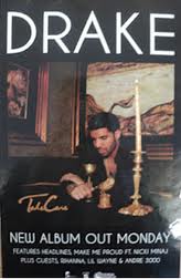
Conventionally an advertisement should include:
-Prominent display of artist name and album title
-Release date
-Image of digipak itself
-Record label logo
-Same graphic style as digipak
I followed these general conventions when making my digipak and also looked specifically at the conventions of a grime/r&b digipak. Looking at other similar artist's digipak's I found that they tend to use dark colour schemes and maintain a reasonably simple, cool and sophisticated over all look. Here is an image of my cd cover front and back and a few examples of how it follows the conventions and style of what is expected of the genre.
All of the above cd covers have used black backgrounds, a clear introductory image of the artist and simple fonts that, like mine, contrast between the artist name and the title. White or pale fonts have been used as in my cd cover. The example I have provided of Rick Ross's cd cover is most similar to mine with a black and white image and subtle bits of grey.
My advert is also similar to other similar artists' :
I have kept the advert simple with minimal colour but just enough for it to stand out, an image of the cd cover and included relevant dates, credits and logos.


No comments:
Post a Comment